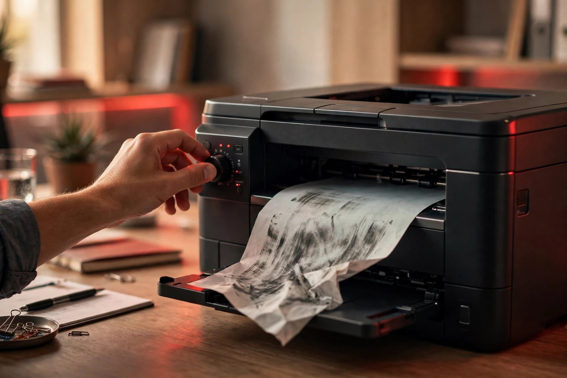
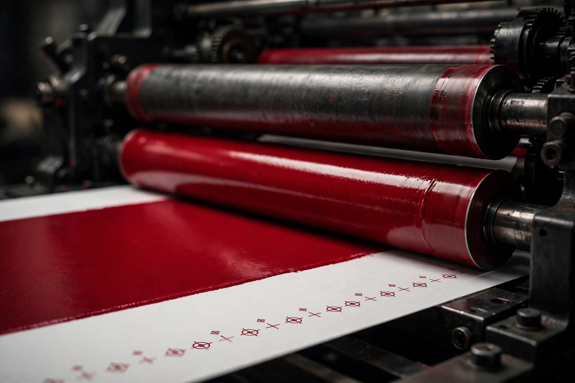
You send a brochure PDF to the print shop. It looks flawless on your screen — sharp type, punchy colors, the photo of the product gleaming. Two days later they write back: "Not print-ready. Please resubmit with bleed, embedded fonts, and CMYK color."
"Print-ready" sounds like jargon, but it names a real and specific thing: a file the shop can load into their system and run without opening your layout, guessing at missing fonts, or converting colors behind your back. Every surprise you hand them becomes a delay, a surcharge, or 5,000 copies of something slightly wrong. Here is what the term actually demands — and how to produce it from whatever tools you use.
The five things "print-ready" means
Strip away the mystique and a print shop is checking five things:
- Every font is embedded (or text is converted to outlines), so nothing substitutes on their machines.
- Color is CMYK or calibrated, not raw RGB — screens and presses speak different color languages.
- Images are high resolution — 300 dpi at the printed size for photos.
- Bleed and trim marks are set — artwork extends 3mm past the cut line; marks show where to cut.
- Nothing interactive survives — no form fields, buttons, video, or encryption. A press cannot click a link.
Get those five right and your file will sail through. The PDF/X standards exist to bottle exactly this: they are ISO-standardized subsets of PDF (ISO 15930) that a validator can check mechanically. If a file claims PDF/X-1a or PDF/X-4, software can verify it really is print-safe instead of taking your word for it.
PDF/X-1a vs. PDF/X-4: which one to send
PDF/X-1a is the cautious, maximum-compatibility option. Everything must be CMYK or spot colors; all transparency must be flattened; every font embedded. It dates from the early 2000s and its own standards body describes it as "maintained as a standard for legacy PDF workflows" — yet many print shops still request it, because it works with essentially any equipment ever made. When a shop says "send PDF/X-1a," they mean it.
PDF/X-4 is the modern default. Based on PDF 1.6, it allows live transparency, layers, OpenType fonts, and ICC color-managed content — meaning you can leave RGB images in and let the color management handle conversion. It requires a reasonably modern RIP (the raster image processor that turns your PDF into ink on paper). For current equipment this is the sensible choice, and most "print-ready PDF" guidance today means PDF/X-4.
There is also PDF/X-6, the PDF 2.0-based successor from 2020 — but adoption is limited because it needs PDF 2.0-aware RIPs that many shops simply don't run yet. Unless your printer specifically asks for it, stay away.
The practical rule: ask the printer first. Their website usually states the version and sometimes even supplies an export preset. If they don't specify, PDF/X-4 is the modern bet; if their equipment is older or they name X-1a, give them X-1a.
CMYK vs. RGB: why the blue goes dull
Your monitor mixes red, green, and blue light — a huge, vivid color range. A press lays down cyan, magenta, yellow, and black ink, which covers a smaller range. Colors that exist in RGB but not CMYK — electric blues, neon oranges, acid greens — get clipped to the nearest printable color when someone converts them, and "nearest" rarely flatters.
This is why shops demand CMYK: they want the conversion done with a proper ICC color profile before export, so you see the honest result, not their software's guess. If you convert with, say, a FOGRA (European) or GRACoL (North American) coated-paper profile, what you see on a calibrated screen is close to what rolls off the press.
Two type-specific details that matter:
- Body copy black should be 100% K only — pure black ink, not a mix of all four. Registration-mix black (all four inks) looks fine on screen but misregisters on press, giving text a blurry halo.
- Large black areas need "rich black" — 100% K alone looks washed out at scale. A common recipe is 60% cyan, 40% magenta, 40% yellow, plus 100% black.
Designers often work in RGB the whole time and convert at export. That's fine — just never let the printer's upload portal be the first thing that converts it.
Bleed, crop marks, and the safe zone
Trimming is mechanical and slightly imprecise. To avoid a white sliver along the edge where the background was supposed to reach, you extend the artwork 3mm past the trim line on every trimmed edge — that's the bleed (US shops say 0.125 inches, same idea). The crop marks (trim marks) are the thin lines telling the cutter exactly where to slice. Anything in the bleed gets cut away.
Then there is the safe zone: keep important text and logos at least 3mm inside the trim line. If the blade lands a hair off, your headline stays intact.
Big formats play by bigger numbers: large-format printers commonly want 10mm or more of bleed, and fabric or wall-mural work can demand far more. Small jobs, small numbers — but the principle never changes.
Fonts: embed them or outline them
The single most common reason print shops reject files is missing fonts. Your file references "Gotham Bold" and their system doesn't have it, so the software substitutes something close. "Something close" has ruined many a headline.
You have two good options:
- Embed the font in the PDF. Most export dialogs do this by default when the font's license allows it.
- Convert text to outlines — text becomes vector shapes, immune to font issues forever. The tradeoff: it's no longer editable text. Always keep a text version of the source file before outlining.
Either is fine. Neither is not. If your export log warns about a font it couldn't embed, stop and fix it — that warning is your file telling you it will break on someone else's machine.
Exporting it: the actual settings
Step 1: Prepare the layout in your design tool
Set the page size to the final trimmed size, add 3mm bleed in the document setup, and pull background artwork into the bleed. Check images: 300 dpi at print size (a 3000×2000 px photo prints cleanly at about 25×17 cm — much smaller and it softens). Delete unused swatches and stray pasteboard elements.
Step 2: Export with a PDF/X preset (InDesign)
File → Adobe PDF Presets → choose PDF/X-1a:2001 or PDF/X-4:2008 (whichever the shop asked for). Under Marks and Bleeds, turn on crop marks and set bleed to 3mm — or "Use Document Bleed Settings" if you set it up in Step 1. Under Output, confirm the color conversion uses an appropriate CMYK profile. Export.
Step 3: The Illustrator and free-tool routes
Illustrator's Save As → PDF offers the same PDF/X presets under the PDF/X tab — set bleed under Marks and Bleeds. On the free side, Scribus (open source) exports PDF/X-3-compliant files, and Affinity Publisher supports PDF/X export presets; both ask for bleed and marks in their export dialogs the same way.
Step 4: Preflight before you send
Open the export in Adobe Acrobat and run Preflight (Tools → Print Production → Preflight) with a PDF/X profile — it mechanically verifies fonts are embedded, images are sufficient resolution, color is declared, and boxes are correct. No Acrobat? At minimum, zoom to 200–300% and scan every page: soft images, missing glyphs, and wrongly converted colors all show up.
Step 5: Send one file, check the proof
Print shops want a single PDF, pages in reading order (not printer spreads — imposition is their job). If they offer a soft proof, actually look at it: proofs exist precisely to catch the things nobody caught.
The preflight checklist
- PDF/X-1a or PDF/X-4 as the printer specified
- All fonts embedded or outlined — zero missing-font warnings
- Color CMYK or ICC-managed (no raw RGB in an X-1a file)
- Photos 300 dpi at printed size
- 3mm bleed on all trimmed edges; crop marks present
- Body text 100% K; large blacks rich black
- No form fields, buttons, video, or encryption
- One file, single pages in reading order
A print-ready PDF is really just professional courtesy in file form: you've done the conversion, the checking, and the trimming decisions so the press operator doesn't have to guess. Do it once properly and every future print job gets easier — because the settings, the preset, and the checklist are already yours.